
In lieu of the standard headshot for Hudson, Feature Inc.
sent various portraits that artists have made over the years; this 'upside-down' portrait is by Judy Linn, whose work is
currently on display 'upfront' at Feature Inc.
As the owner of the highly-respected art gallery Feature Inc. for
27 years, Hudson has exhibited art uncompromisingly based on aesthetic
-- not business -- principles, as well as the values of pluralism and
diversity shaped during his years as an artist and non-profit arts
administrator. Feature, which began in Chicago, moved to NYC's Soho,
then Chelsea, and now located on the Lower East Side, launched the
successful careers of Raymond Pettibon, Jeff Koons, Takashi Murakami,
Richard Prince, Charles Ray, Tom Friedman, and many others. Yet
throughout Feature's history, Hudson has exhibited and supported
art/artists without regard to economic considerations or the artists'
positions within the critical art establishment. He continues to exhibit
some of the most incredible and interesting art in New York City today,
and his gallery is a favorite among artists as well as critics and
smart collectors.
All images courtesy of Feature Inc., Hudson and the artists.
(A version of this interview appeared on the Huffington Post in September of 2012.)
Julie Chae: How did you decide you wanted to open your own gallery?
Hudson: In mid-1983 I decided to leave the not-for-profit sector, the
artists-run spaces, and open a commercial gallery (on April Fool's Day,
1984). I used a few thousand dollars from a grant that I had received
for my work as an individual artist and a $ 5,000 loan from my father to
open the gallery.
For the two or so years prior I had been increasingly dissatisfied
with the watered-down results of the peer-panel decision process that
was then, for that field, the structure by which curatorial decisions
were made, and wanted to find a way out of that. I was more interested
in the way autonomy allowed me a greater range of possibilities, wider
extremes, swifter decisions, and a more expansive thinking. A gallery
seemed the way to go.

This photo of Hudson with Tom Friedman's sculpture is by Judy Linn
JC: Your consistently strong vision for groundbreaking art
amazes everyone. What has shaped your artistic sensibilities and helped
determine the kind of art you want to share with the public?
Hudson: Certainly my largest influence is derived from my experience
of being an artist who is content-oriented -- making work more
meaningful by working from the personal -- and having an interest in and
respect for skill and technique. But I also am deeply indebted to my
experiences in the not-for-profit sector, where the commitment is to art
and artists and not economics or trends.
JC: Getting more specific, what makes you choose to display one artist's work and not another's?
Hudson: There are a number of factors, some personal and some social, things like:
that the artist has been developing their skills and ideas for more than
five or so years, seems committed to their investigation, and while
there is a solid sense of form and resolve in the work it also displays
the possibility to develop/change; that there be a sense of adventure,
care, intelligence (but not overly so), investigation, and intuition in
the artist and their work; my excitement about the work and how its
meaningfulness interfaces with my perception of what is going on in the
art world and the culture at large; wanting to encourage the artist to
continue to grow and expand and bring more of what they are doing into
the world; that there is a personal uniqueness in what they are doing...

This bubblegum drawing of Hudson is by Jim Shaw
JC: So how much of your decision is influenced by factors
related to the artist versus the artwork? In other words, how much, if
at all, does it matter to you that an artist makes great work AND not be
a pain in the ass?
Hudson: Art first, artist next, gallery third, me fourth. Yet if an
artist is a big pain in the ass, I will pass on working with them and
their work.
JC: As you know, I'm friends with Douglas Melini who recently
had a solo show at Feature Inc. this past July/August and received a
terrific NYTimes review (Roberta Smith). So for example, could you describe how you decided to exhibit Doug's work?

Douglas Melini: A Sharing of Color and Being Part of It (10 July - 11 August 2012) at Feature Inc.
Hudson: I've been watching Doug Melini's paintings for about ten years, since I saw his exhibition at White Columns in 2003.
His paintings have always been catching my eye, but in terms of
representing artists, I am generally hesitant with the more formal types
of abstraction as, soon after the initial inventiveness is established,
far too often it slips into a kind of arrested development. Its
horizontal expansion becomes predictably incremental and there is almost
no vertical expansion. Frequently this type of art becomes fussy and
insular, two qualities that I prefer less of. I wanted to be fairly
certain that this would not happen with his work.


Douglas Melini, Colossus, acrylic on canvas, overall
dimensions 8 ft x 63 ft (2000-2003), white room installation views at
White Columns in 2003; courtesy of the artist
JC: And what happened as you were watching Doug's work over the years?
Hudson: Two or three years ago, when he added his hand-painted frames
to the paintings, and 'the painting' thoughtfully moved into new
territory, from paintings to painted objects, I could sense that his
thinking, inspiration, and intuition were quite secure. Then it was just
a matter of scheduling.

Douglas Melini, The Forms of Thought, acrylic paint on canvas with hand-painted frame; 71.5 x 45.5 x 1.75" (2010)

detail of hand-painted frame, right side edge
JC: How did you decide to schedule his show? Were you thinking in terms of other exhibitions and your programming?
Hudson: It was in fall of 2011 that I began to think that he should be the summer 2012 exhibition at Feature. That is a time I traditionally use for a group exhibition, but I thought what he was doing was important/engaging/developed to warrant a one-person exhibition. In terms of programming continuity, I'm not a strategic planner. My opinion is that you just butt good things up against one another and let them do the work.
JC: Do you have a certain way of describing an artist's work to say, collectors, or others who might inquire?
Hudson: When someone asks me about any artist's work, I address what the artwork means to me, my excitement and interest in the physical nature of the work and its surrounding ideas and that work's relationship to this time we live in.
JC: What about the artist's background?
Hudson: I generally don't speak much about the artist's exhibitions history, collection inclusions, or cite their education. None of that stuff has anything to do with the successfulness of the work. And when one is appreciating and purchasing art, especially with younger and mid-career artists, it is the art and not the social position or investment that is important and meaningful.
JC: I don't know how you keep finding such incredible artists; one of my very favorites at Feature is David Shaw. I have just decided to accept that I love everything he does. Can you explain why his work is so appealing?

David Shaw, Lee, wood, glass, 41 x 38 x 51 inches (2009)
Hudson: The nature/science discussion in David Shaw's work is
particularly timely, wide and loose, and is enhanced by the work's
engaging materiality. Some aspects of the work are quite literal, some
physical, some are poetic, and yet some others link to you via
intuition, intellect, or playfulness. This complexity allows viewers to
enter his works from a variety of hallways that are all relatively
friendly and open.

JC: How did you start working with David and what is it like working with him?
Hudson: He introduced his work to the gallery via the quintessential packet of images/info very soon after the gallery's 1988 move to NYC. Working with him continues to bring me a wide range of information, images, and ideas that enhance my understanding and appreciation of his work and, as well amuse my day-to-day. The guy is rigorous, decisive, comprehensive in his thinking, has a terrific sense of humor, and is relatively fearless.
JC: I also love the drawings on (pink!) paper by Kinke Kooi. It's a purely visceral reaction; they are amazing. You've worked with her for a while now -- what makes her work so wonderful?

David Shaw, Dark Materials, 2011; wood, steel, holographic laminate, paint, epoxy, flocking; 31 x 22 x 13.5”
JC: How did you start working with David and what is it like working with him?
Hudson: He introduced his work to the gallery via the quintessential packet of images/info very soon after the gallery's 1988 move to NYC. Working with him continues to bring me a wide range of information, images, and ideas that enhance my understanding and appreciation of his work and, as well amuse my day-to-day. The guy is rigorous, decisive, comprehensive in his thinking, has a terrific sense of humor, and is relatively fearless.
JC: I also love the drawings on (pink!) paper by Kinke Kooi. It's a purely visceral reaction; they are amazing. You've worked with her for a while now -- what makes her work so wonderful?

Kinke Kooi, Female View, acrylic paint, graphite on paper; 36.75 x 26 inches (2010)
Hudson: The primary grabs of Kinke Kooi's works on paper are the
slowly drawn repetitive graphite lines lying on top of the individually
hand-coloured pink paper, the way the depicted scenes dive deep into
increasing detail, how her rendered representation smoothly moves in and
out of areas of abstraction, the playful push and pull between
foreground and background, and the way big ideas and little ideas sit
comfortably together.

Kinke Kooi, Everything Is Vain, 2011; acrylic paint, marker, graphite on paper; 30.25 x 22.375 inches
JC: Looking back on all this time you've been running your gallery and looking forward as well, what are your ultimate hopes and goals for yourself and for Feature Inc.?
Hudson: So I've had the gallery for 27 years and, it seems that throughout the years, the driving force has remained the same: to exhibit and share my excitement for what and how artists do what they do. I really don't have other goals; its been a slowly evolving situation. When I look back at Feature Inc.'s history the essence is the interaction of art and people. It's been an inspiring education.

This graphite portrait drawing of Hudson is by Michael St. John

Judy Linn, Bud, 2012; digital inkjet print; 22 x 16.5 inches; ed. 1/7; currently on view at Feature Inc.

Josh Podoll, A Color that Does Not Exist, 2012; acrylic paint, oil paint on canvas; 24 x 18 inches;
in "Josh Podoll: paintings," currently on view at Feature Inc.
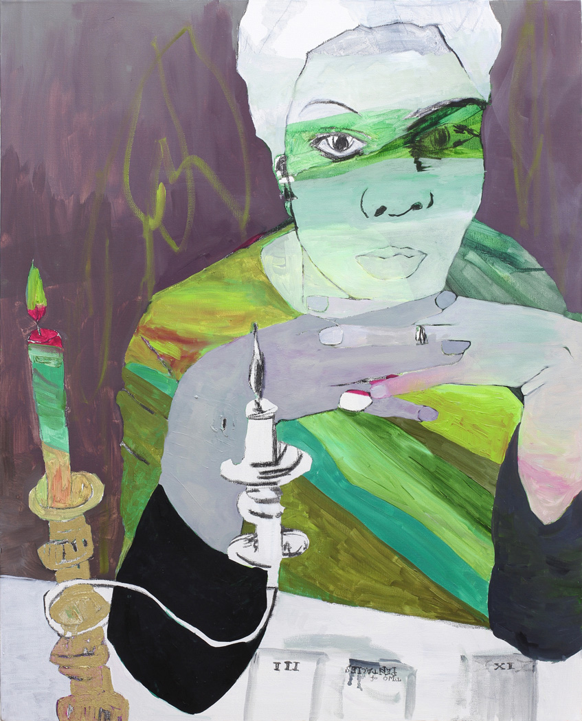
Gina Magid, Le lecteur de tarot (Nina Simone), oil paint,
charcoal on canvas, 30x24" (2012);
in "Gina Magid: paintings," currently
on view at Feature Inc.
Current exhibitions on view: September 5 - October 7, 2012; for more information, see: http://featureinc.com/.

David Shaw's Dark Materials (2011), wood, steel, holographic laminate, paint, epoxy, flocking, 31 x 22 x 13.5" (l) and Doug Melini's Invisible Change (2012), acrylic paint on canvas with hand-painted frame, 23.5 x 19.5 x 1.75" (r)
David Shaw describes the moment of inspiration that resulted in this photo:
This image came about when I stopped by Feature to decide on pedestal sizes for Dark Materials because Hudson was showing it in the Nada Art Fair in Hudson, NY. It was a few days before Doug's opening and his incredible exhibition was already installed. (I have been a fan since before Hudson was showing him and asked Hudson to take another look at his work back in the day.) We pulled out the box pictured so as to have a visual take on the height and so forth, then Hudson got a phone call. I quickly moved the box and sculpture into the exhibition space and snapped this pic for Doug. The formal relationship was undeniable even at a distance, but setting it up this way highlighted the fractured chemical underpinnings of each piece. Doug's painting Invisible Change became a schematic, an origin, a synaptic plan for Dark Materials and, when I think about it, vice versa...
-- David Shaw, September 2012
No comments:
Post a Comment